

The Visuals of Sound
Stories of cover art collaborations

Humans have a strange way of pairing sight and sound.
When I conduct sound baths, I hand out eye masks to help participants along with the deep listening practice. “When the eyes are closed, you can tune in better with your ears,” I say.
But then, what visuals appear in the mind when the sounds play? I am always amazed at the feedback people give. Various images come to them, memories, visions of the future, sometimes colors.
I thought about this when I purchased Dave Brubeck’s classic 1959 Time Out album from an antique shop recently. I chose it because I adore the great jazz pianist, but I actually don’t have a working record player. It was really the funky abstract art on the cover that appealed. I hung it on a wall, vowing to add others, and have since begun to notice album cover art more keenly, and to wonder about the process: how does it come to pass that the artists like Time Out’s cover artist S. Neil Fujita figure what will match with the music?

I first put the question to Hollis King, longtime creative director for Verve Music Group, a man well known for his genius finding just the right images to convey the sounds of top artists spanning many decades, including Linda Ronstadt, Wayne Shorter and Herbie Hancock.
What was his secret behind so many magical covers?
“To somehow find the marriage between the visual and the specific intent of the artist, that’s what you have to do.”
King told me this over the phone the other day, his lilting Caribbean accent itself a fit with his inimitable dapper style. One could almost see the scarf wrapped casually around his neck. “To make the art, it always starts with a conversation,” he said.

Oh, to be a fly on the wall for those conversations! When I asked about some of his memories of those creative confabs, he told me about the afternoon years back when he met with Natalie Cole about the cover art for her 2002 album, Ask a Woman Who Knows.
“It was the first record I did with her,” he said, setting the scene by describing the light pouring in through the glass walls of his office, and Cole walking in wearing all black and dark glasses, sitting, he said, “on the furthest edge of the couch on the far end of the room.”
She came in, he said, “with an attitude that was not good, and she said to her manager curtly, ‘tell him what we want.’ “
He laughed. “I was prepared, though,” he told me. “I’d called some friends beforehand who said, ‘man, she’s difficult.’ All I could really do was research as much as possible. So, when her manager said, ‘We want [the cover to be] a picture of Natalie, an image of her face and a 3/4 length shot of her…’ I just said, ‘that’s interesting,’ and I got up and walked over to turn around a wall I’d created of all the images of her past albums.”
He continued, a smile clearly playing on his lips. “‘So’, I said, ‘she wants to do the same shit she’s been doing then.’ Natalie then flings off her glasses and looks at me. ‘Well,’ she said, ‘what do you want to do?’”
Voila. One could hear the sound of victory in King’s voice when he described the scene, and how he went on to ask Cole what was happening vis-à-vis her notorious drug habit. It turned out she’d spent months in the Betty Ford Clinic and his mind reeled suddenly with the idea of presenting her almost like a Greek Goddess, strong and powerful, which he shared with her.
“All of a sudden, she changed, she was an ally. And then I said, ‘As a matter of fact, I want you to walk on water…’” He laughed remembering how panicked he became after he closed the door on Cole after that meeting, how he went quickly into planning and prep for creating the lucite table that would stand underneath her feet in the water, for finding and renting the Malibu mansion with the perfect pool for the shoot.
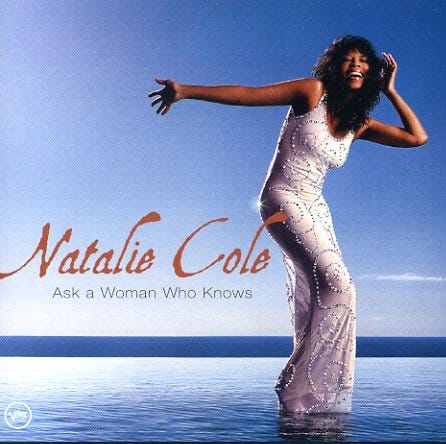
He recalled how she said over and over again on that infamous day, “If I fall, I’m gonna sue somebody.”
Dealing with big personalities is of course a large part of the process of art/music collaborations, but so too “just making something beautiful, even for artists with no budget,” King said.
“That’s my job: to make something beautiful that will make people want to listen to the music. Beauty is everywhere, I just have to put it in a form where people understand it.”
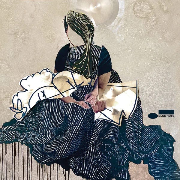
The trust a musician must place in an artist to interpret their sound in beautiful visual form is immense. Great jazz drummer and composer Johnathan Blake shared with me his thoughts about the last two albums he’s made on the Blue Note label, Homeward Bound in 2021, and Passage in August 2023.
First off, the record company allowed him to choose his own photographer and designer, the artist Dave Ellis, brother of jazz saxophonist John Ellis, who Blake said “painted the mural in the [Village] Vanguard in the drum corner, a sort of animation. I’m a big fan, I’ve always loved his work. He has such a great imagination.” Blake spoke of Ellis in his signature enthusiastic way, eyes (though I couldn’t see them over the phone) most likely wide in deep appreciation of his fellow artists’ work, in awe.
While very different, both covers have no title on them, just the Blue Note logo, because, Blake said,
“I really wanted the art to stand on its own, to let people take it in, and allow their imagination to run with it.”
The title track of Homeward Bound is dedicated to Ana Grace Marquez-Greene, the daughter of saxophonist Jimmy Greene and flutist Nelba Marquez-Greene who died at Sandy Hook while Blake was on tour with Greene. The cover, a faceless image of a girl drawn sitting in a dotted-line dress, the many folds of her skirt enveloping her, features collage elements including cut out photos of mens’ hands. The lines and ripples throughout spark just the sort of vibrating undulating tones of emotion that the album stirs.
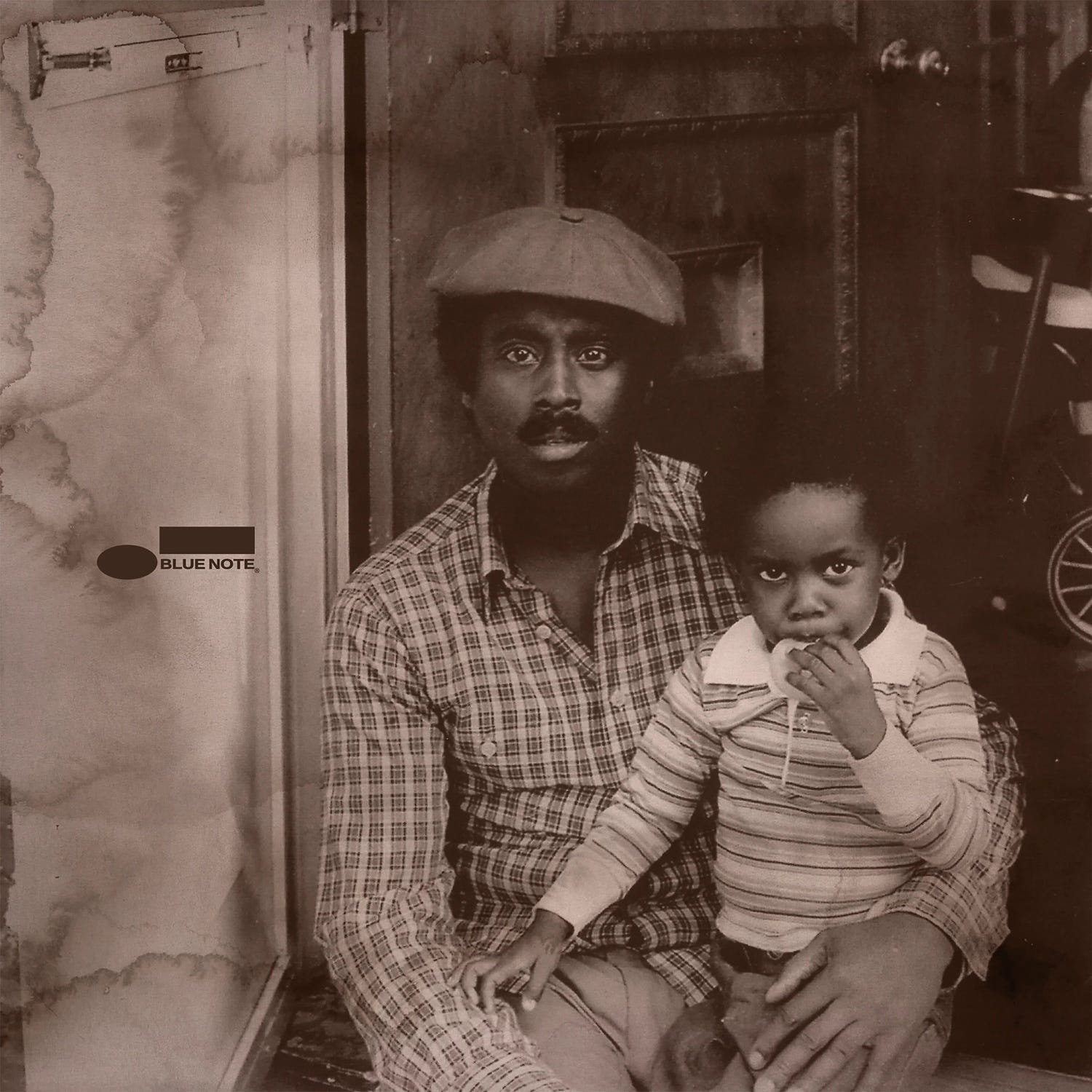
Passage features a title track written by Blake’s father, the late jazz violinist John Blake, Jr., who passed away nearly 9 years ago, before he had the chance to record it.
“I always said, ‘You have to record this song!’ but he didn’t, so when I had the opportunity, I wanted to showcase his music and allow people to connect with him even though he’s not with us physically,” Blake told me.
The cover photo of Blake sitting on his father’s lap, the two of them staring out with almost identical deeply intense expressions, was one Blake’s mother found and gave him, taken by his godfather, now legally blind. The way Ellis used it, the tones and grain of it, how it is cropped to dramatize father and son, gives off the same deeply resonant sense of longing and nostalgia mixed with a profound clarity and wonder that Blake’s music (and self) evokes. Beautiful.
“A lot of people tell me ‘I bought two of these records just because the artwork spoke to me,’” Blake said. I could see him shaking his head with the thought:
“It’s crazy how closely related art and music are!”
For the recent release of his 10th studio album, The Presentation of Self in Everyday Life, singer/songwriter Stephen Clair reached back out to artist Randall Martin who’d done art for a previous album and “let him have at it. I just sent him the songs and said, ‘whatever you think,’” Clair said.
For his previous album, he had been more specific with Martin, asking for “a fable, black and white, like a woodcut.”
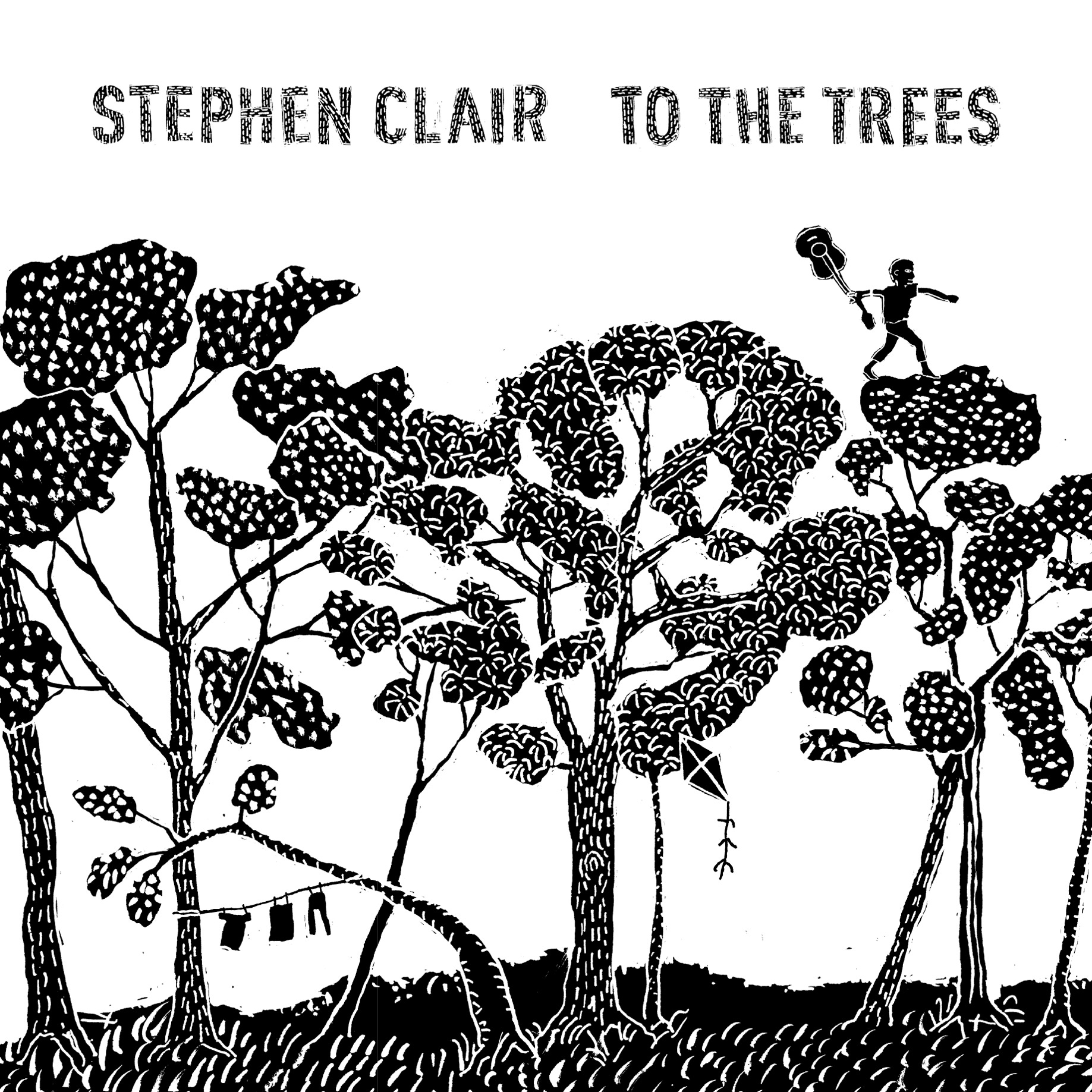
But for this “naked” solo guitar and vocals effort, he placed total faith in Martin, a friend who knows him well.
“I enjoy that ride of trusting someone else’s hunches,” Clair said.
And he was overjoyed at what those hunches net, a series of super-colorful hand-drawn vignettes, small stories representative of the individual songs.
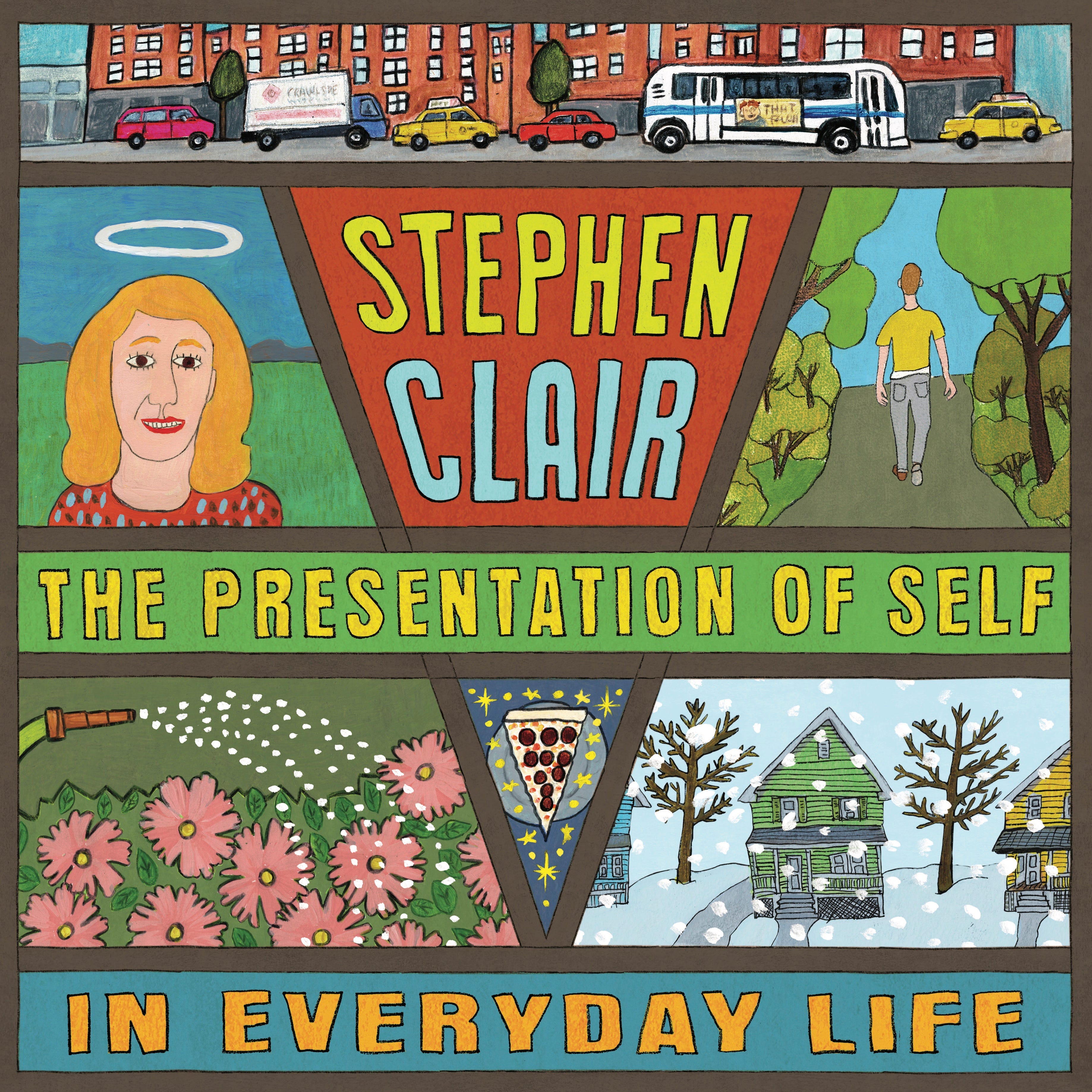
“When he sent it to me, I loved and embraced it, right off. It blew me away how much it portrayed just exactly how I want to be represented, as a teller of tales, of parables.
“There’s a conversation going on between the album cover and the music, and you can’t hear the music and not think about it.”
Sight and sound, united, a perfect pairing between visual artists and those who create stories with music. The collaborations and the stories behind them are endless.
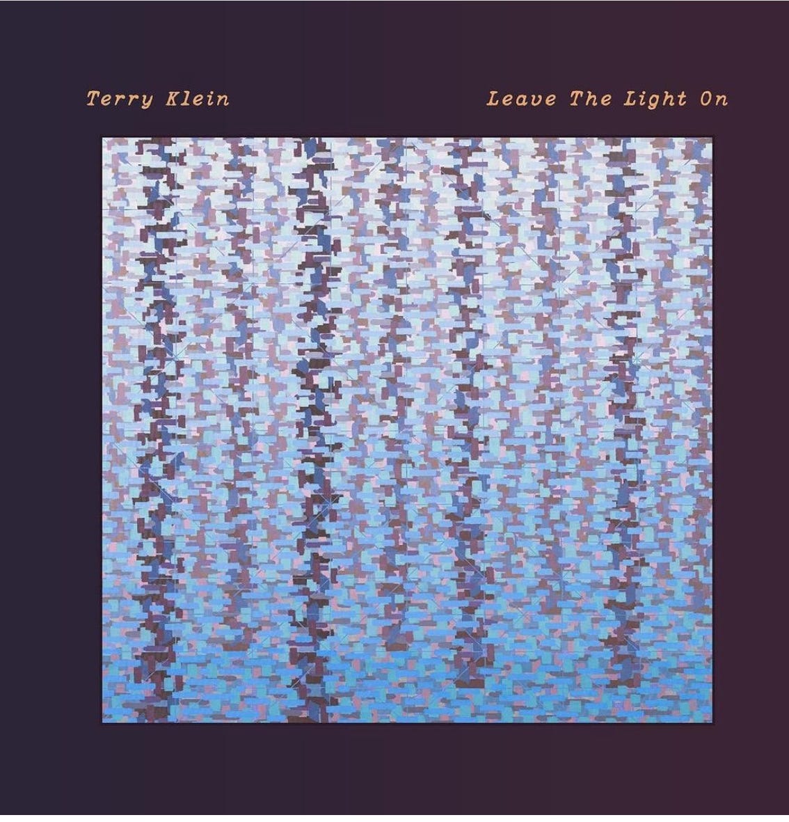
I was mentioning working on this story at a gallery opening last week at The Shirley Project space in Brooklyn, and artist Rachael Wren whose Site Lines show I’d done a sound bath for there said she’d been approached by folk/Americana singer songwriter Terry Klein.
He’d googled “Shimmers and Hums,” the lead-off song for his recent album, Leave The Light On, and discovered an article about Wren’s current work, a series that combines elements of landscape and geometric abstraction. He felt like it was meant to be, and asked to feature it as the cover art on his album.
Sometimes, often, the universe seems to decide the links that are meant to be made between artists. And it is up to us to note these magical collaborations, and appreciate them.
Leave a comment to let me know your favorite album covers and why!!!